
The Bush "Guard memos" are forgeries!
| Home | |
 |
Resume |
|
The Bush "Guard memos" are forgeries! |
|
| UPDATE HISTORY | |
| 12-Sep-04 | Kerning and pseudo-kerning. Digital signature copying. |
| 13-Sep-04 | Varityper |
| 13-Sep-04 | Comparison of numeric 1 and lower-case L |
| 15-Sep-04 | The Selectric Meltdown |
| 17-Sep-04 | More about the Selectric Meltdown; Pixelization |
| 18-Sep-04 | The IBM Executive Typewriter; Chain of custody; Records retention cycles |
| 3-Oct-04 | The Hailey Connection |
| 10-Oct-04 | The New York Times Font |
| 20-Oct-04 | Some personal reflections on this whole experience. |
| 11-Jan-05 | The Columbia Journalism Review |
| 11-Jan-05 | Hailey's response to my work |
First off, before I start getting a lot of the wrong kind of mail: I am not a fan of George Bush. But I am even less a fan of attempts to commit fraud, and particularly by a complete and utter failure of those we entrust to ensure that if the news is at least accurate. I know it is asking far too much to expect the news to be unbiased. But the people involved should not actually lie to us, or promulgate lies created by hoaxers, through their own incompetence.
There has been a lot of activity on the Internet recently concerning the forged CBS documents. I do not even dignify this statement with the traditional weasel-word “alleged”, because it takes approximately 30 seconds for anyone who is knowledgeable in the history of electronic document production to recognize this whole collection is certainly a forgery, and approximately five minutes to prove to anyone technically competent that the documents are a forgery. I was able to replicate two of the documents within a few minutes. At time I a writing this, CBS is stonewalling. They were hoaxed, pure and simple. CBS failed to exercise anything even approximately like due diligence. I am not sure what sort of "expert" they called in to authenticate the document, but anything I say about his qualifications to judge digital typography is likely to be considered libelous (no matter how true they are) and I would not say them in print in a public forum.
I am one of the pioneers of electronic typesetting. I was doing work with computer typesetting technology in 1972 (it actually started in late 1969), and I personally created one of the earliest typesetting programs for what later became laser printers, but in 1970 when this work was first done, lasers were not part of the electronic printer technology (my way of expressing this is “I was working with laser printers before they had lasers”, which is only a mild stretch of the truth). We published a paper about our work (graphics, printer hardware, printer software, and typesetting) in one of the important professional journals of the time (D.R. Reddy, W. Broadley, L.D. Erman, R. Johnsson, J. Newcomer, G. Robertson, and J. Wright, "XCRIBL: A Hardcopy Scan Line Graphics System for Document Generation," Information Processing Letters (1972, pp.246-251)). I have been involved in many aspects of computer typography, including computer music typesetting (1987-1990). I have personally created computer fonts, and helped create programs that created computer fonts. At one time in my life, I was a certified Adobe PostScript developer, and could make laser printers practically stand up and tap dance. I have written about Microsoft Windows font technology in a book I co-authored, and taught courses in it. I therefore assert that I am a qualified expert in computer typography.
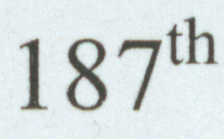 |
| 187th scanned in from my Word document, original 1200dpi, scanned at 600dpi |
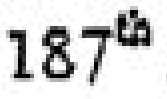 |
| 187th screen shot from 18-August-1973 memo |
 |
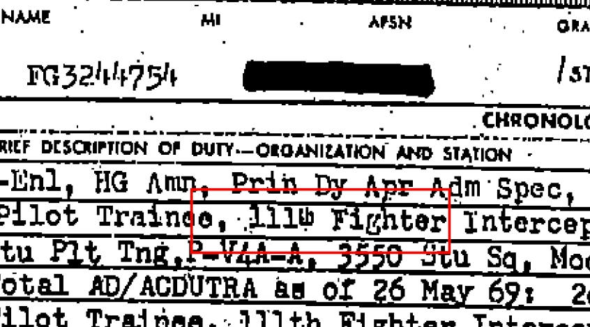
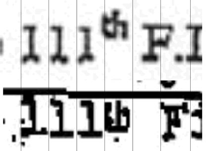
| 111th captured from screen shot of 4-may1972 memo |
 |
| 111th enlarged from CBS justification image |
The probability that any technology in existence in 1972 would be capable of producing a document that is nearly pixel-compatible with Microsoft’s Times New Roman font and the formatting of Microsoft Word, and that such technology was in casual use at the Texas Air National Guard, is so vanishingly small as to be indistinguishable from zero.
If someone had come forward presenting a “lost” painting by Leonardo da Vinci, which used acrylic paints including Cadmium Yellow and Titanium White, art experts would roll of the floor laughing at the clumsiness of the forgery. (Acrylic paints were not known until the 1920s, although some histories date them as late as the late 1940s, and some as late as 1955; Cadmium Yellow was not known until 1840, and Titanium White was not available as an artist's pigment until 1921). Yet somehow a document which could not be created by any of the common office technology of 1972 is touted as “authentic”.
“Apologists” that try to claim these documents are authentic have pointed out that there were technologies for doing electronic typesetting, for doing proportional fonts, and even doing something that resembles superscripting. One document cited as proving that a typewriter could do superscripting is a document which is part of the files released by the White House and the Pentagon. I was able to locate this document, which was said to have been used by CBS as "proof" that superscripting was possible. The excerpt shown here is from page 15 of the document.
 Let's
look at some comparisons. Realizing that we are working from several times
removed from the "original" document supplied to CBS, it is still worth doing
some comparisons. On the left I show several images. The first element, the 187th,
is from a document I printed on my printer, at 1200dpi and scanned at 600 dpi.
It is obviously enlarged here. Note the "th" is approximately centered on the
top line of the "7". The second image is a screen capture from the
18-August-1973 memo. While some details are lost (perhaps CBS could post some
hi-res scans as gif files?), note that the "th" is superscripted, and apparently
by the same amount; note the "th" is approximately centered on the top line of
the "7".
Let's
look at some comparisons. Realizing that we are working from several times
removed from the "original" document supplied to CBS, it is still worth doing
some comparisons. On the left I show several images. The first element, the 187th,
is from a document I printed on my printer, at 1200dpi and scanned at 600 dpi.
It is obviously enlarged here. Note the "th" is approximately centered on the
top line of the "7". The second image is a screen capture from the
18-August-1973 memo. While some details are lost (perhaps CBS could post some
hi-res scans as gif files?), note that the "th" is superscripted, and apparently
by the same amount; note the "th" is approximately centered on the top line of
the "7".
Next, we get the 111th image. The image I show is a screen capture from the CBS document which claims to be a memo dated 04-May-1972. Note the "th" is approximately bisected by the top line of the 1. So this seems to also be in the same position as the position Microsoft Word uses. But when we look at the "th" of the image which is apparently used to justify the fact that a typewriter could do a superscript, we find that it is not a superscript, but in fact a character that appears to be simply raised from the nominal baseline by approximately 10%, but does not exceed the top of the line. This proves that there was a typewriter that had a "th" key, but it looks so different from the previous three examples that it is hard to believe that such a typewriter could have created the same memos.
Now let's look at the comparison of the two 111th in a calibrated
fashion. What I did was create a set of equally-spaced vertical lines, then I
stretched the CBS justification image so the characters all lined up. Note they
are monospaced. The "th" takes up one character position. Then above it, I
stretched the image from the 04-May-1972 image (in both cases maintaining the
aspect ratio) until the digits lined up. Even in proportional fonts, the digits
are always designed to have the same width to simplify doing columns of digits.
Note how the "th" is not quite aligned right, and the spacing is not uniform. So
we take a typewriter with a monospaced font and a ligature, and claim that it
justifies the existence of a memo in variable-pitch font, with a different
superscripting mechanism (suspiciously like that of Microsoft Word!)?
.Using arguments like this would be equivalent to someone justifying the “genuine” da Vinci by saying that yellow paint existed, and white paint existed, and ignoring the obvious fact that Cadmium Yellow or Titanium White could not exist. Some have contended that since Times New Roman was a typeface invented “in the 1940s” (according to Linotype, the copyright holder for Times New Roman, it was first used by the New York Times in the edition of 3 October 1932; the original TimesTM font is stated to have been created in 1931 for the London Times; in either case, however, the date is established as being earlier than 1972), it is not unreasonable that it could exist in 1972. Yet I knew most of the sites that, in 1972, had printers and computer-based formatting technology that could have printed a document in proportional-spaced fonts, and these included MIT, Carnegie Mellon (where I did my work), The University of Southern California Information Sciences Institute (USC-ISI), and Xerox’s Palo Alto Research Center (where the personal computer as we know it was invented). I no longer recall how many XGP printers existed, but I believe the number was not much more than a dozen. None of these printers could print more than about 180 dots per inch, a quality somewhat lower than a contemporary fax, yet the image I downloaded from the CBS site appears to have been printed on a printer of much higher resolution. The only other printer I am aware of in the 1970s that could print at reasonable quality was a research prototype I saw at Xerox PARC, called EARS, which could print at 300 dpi. It was not created until 1971, and I remember it has having several large cabinets of extremely expensive computer components controlling it. It was a “hand-built”, one-of-a-kind printer. All other technologies were quite elaborate and clumsy mechanical devices, and although there were some proportional-spaced typewriters (such as the IBM Executive) and print production technologies (such as the VariTyper), none of these would have produced something that was a near-perfect match for Times New Roman under Microsoft Word. Don Knuth’s seminal work on computer font technology (“TEX and Metafont: New Dimensions in Typesetting”) was not printed until 1979, “on experimental printing equipment” at “Xerox Research”. Phototypesetters of the era projected one character at a time onto a film, then moved the template containing the photos of the characters, then exposed the next character. They were exceedingly slow relative to, say, a typewriter, and cost a LOT of money. The resulting film had to be developed, and a printer plate had to be created from this negative. It seems unlikely that this technology would have been used to create private memos. My aunt ran the printing division in a local company in the late 1960s, and I know what technology she was using (it was leading edge for its time). It would not have been available to a military base--at least in the administrative offices--in 1972, nor would it have been practical. It used technology that was a precursor of modern laser printers, but it was all purely optical, using VariTypers, large-scale cameras, and a very primitive form of xerographic technology.
 Some
have argued that the documents are forgeries because the characters are
“kerned”. Kerning is an operation which tucks characters together to compact
space. However, Microsoft Word by default does not kern text. The text of
the memo is not kerned. Kerning is a pairwise operation between
characters, and each character pair that can be kerned has a specified kerning
value. Microsoft fonts and many others come with accompanying kerning data. But
kerning is complex, and computationally expensive, and therefore would have
slowed down redisplay in a WYSIWYG editor. However, Times New Roman uses a characteristic of
Microsoft TrueType fonts called the ABC dimensions, where the C dimension is the
offset from the right edge of the bounding box of the character to the next
character. If this offset is negative, the character with the negative C offset
will overlap the character which follows (in some technologies, the distance
from the start of one character to the start of another is called the
“escapement”, so a negative C offset gives an escapement which is less than the
character width). This gives the illusion of kerning, or what I sometimes call
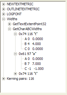
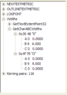
“pseudo-kerning”. I discuss the ABC width mechanism in some detail in a book I
wrote in 1997 (“Win32 Programming”, with Brent Rector, Addison-Wesley, 1997, p.
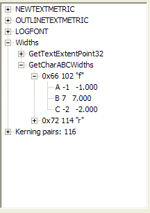
1104). I have attached sample output from a program I used to create
illustrations for that book, one of which shows the characters “fr” and one of
which shows the C offset of the “f” character is “–2”. ALL technologies I am
aware of in 1972 that would have been available for office work (not, say, the
sort of production book typesetters that major publishers might have had) could
only advance an integral number of units, and could not “tuck in” the characters
like Microsoft’s Times New Roman font under Microsoft Word does, by using a
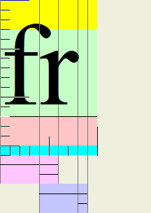
negative partial-character offset. Examine carefully the “fr” in the word “from”
in the 18-August-1973 memo. The “r” is tucked under the “f” in the same way a
Microsoft font does it. In 1972, technology available in the office, including
proportional typewriters, could not do this. So it is clear that the only way
this document could have been done is using a modern computer font, and the
placement is pixelwise identical to Microsoft’s Times New Roman. The work we did
at CMU could not support kerning or pseudo-kerning of text. We knew about
kerning, but our software could not support it. I have not examined a New York
Times of 1972, but I would be extremely surprised if the font used at that time
exhibited any form of kerning (I should point out that Linotype machines—the
hot-lead machines—had paired characters such as “fi”, which were actually a
single slug. Character sequences like these are called a “ligature”
Some
have argued that the documents are forgeries because the characters are
“kerned”. Kerning is an operation which tucks characters together to compact
space. However, Microsoft Word by default does not kern text. The text of
the memo is not kerned. Kerning is a pairwise operation between
characters, and each character pair that can be kerned has a specified kerning
value. Microsoft fonts and many others come with accompanying kerning data. But
kerning is complex, and computationally expensive, and therefore would have
slowed down redisplay in a WYSIWYG editor. However, Times New Roman uses a characteristic of
Microsoft TrueType fonts called the ABC dimensions, where the C dimension is the
offset from the right edge of the bounding box of the character to the next
character. If this offset is negative, the character with the negative C offset
will overlap the character which follows (in some technologies, the distance
from the start of one character to the start of another is called the
“escapement”, so a negative C offset gives an escapement which is less than the
character width). This gives the illusion of kerning, or what I sometimes call
“pseudo-kerning”. I discuss the ABC width mechanism in some detail in a book I
wrote in 1997 (“Win32 Programming”, with Brent Rector, Addison-Wesley, 1997, p.
1104). I have attached sample output from a program I used to create
illustrations for that book, one of which shows the characters “fr” and one of
which shows the C offset of the “f” character is “–2”. ALL technologies I am
aware of in 1972 that would have been available for office work (not, say, the
sort of production book typesetters that major publishers might have had) could
only advance an integral number of units, and could not “tuck in” the characters
like Microsoft’s Times New Roman font under Microsoft Word does, by using a
negative partial-character offset. Examine carefully the “fr” in the word “from”
in the 18-August-1973 memo. The “r” is tucked under the “f” in the same way a
Microsoft font does it. In 1972, technology available in the office, including
proportional typewriters, could not do this. So it is clear that the only way
this document could have been done is using a modern computer font, and the
placement is pixelwise identical to Microsoft’s Times New Roman. The work we did
at CMU could not support kerning or pseudo-kerning of text. We knew about
kerning, but our software could not support it. I have not examined a New York
Times of 1972, but I would be extremely surprised if the font used at that time
exhibited any form of kerning (I should point out that Linotype machines—the
hot-lead machines—had paired characters such as “fi”, which were actually a
single slug. Character sequences like these are called a “ligature”
 and were a
special case of kerning. Common ligatures included fi, fl, ffi, ffl, among
others. This was an example of kerning built into the font definition, and
Linotype machines had separate keys that dropped these slugs into place. Lead
type set by hand also had similar ligatures. The illustration is scanned from
The Unicode Standard Version 3.0, Addison-Wesley, 2000, p.804).
and were a
special case of kerning. Common ligatures included fi, fl, ffi, ffl, among
others. This was an example of kerning built into the font definition, and
Linotype machines had separate keys that dropped these slugs into place. Lead
type set by hand also had similar ligatures. The illustration is scanned from
The Unicode Standard Version 3.0, Addison-Wesley, 2000, p.804).
Hot lead type could not kern, because of the need to have a Linotype machine drop slugs into a frame, which was then filled with hot lead. Any publishing technology that used hot lead typesetting could not support kerning, except by the aforementioned ligatures. Any technology that used hand-set type could not support kerning without such a high expense that it is unlikely it was ever done. Not even Word supports kerning without selecting a special option (and if selected, the resulting document does not look like the memo). But somehow, magically, the font used by some hypothesized piece of equipment in 1972 works the same was as a font that uses a set of ABC width parameters that did not exist until TrueType fonts existed. Microsoft delivered the first version of TrueType for Windows in April of 1992, and the original TrueType font format was developed by Apple and delivered in May, 1991.
Based on the fact that I was able, in less than five minutes, to replicate one of the experiments reported on the Internet, that is, to type in the text of the 01-August-1972 memo into Microsoft Word and get a document so close that you can hold my document in front of the “authentic” document and see virtually no errors, I can assert without any doubt (as have many others) that this document is a modern forgery. Any other position is indefensible. I was a bit annoyed that the experiment dealing with the 18-August-1973 memo was not compatible, until I changed the font to an 11.5-point font. Then it was a perfect match, including the superscript “th”. In 1972, we expressed fonts in integral pixel sizes, and a fractional pixel size would have been meaningless. Until we got high-resolution printers in the 1990s, I am not aware of any application-level technology that supported fractional point sizes (Adobe PostScript could, but the high-level interfaces to it, to the best of my recollection, only allowed integers to be specified for sizes). I do not believe a typesetting program or typesetting technology that worked in fractional point sizes could have existed in 1972 or 1973. However, this might be an accident of the many levels of transformation from the original (wherever that is) and the photocopying, scanning, document conversion, and re-printing. The 11.5-point font could represent a reduction to 96% of the original size in the various transformations. In which case, the coincidence of the match is again extremely unlikely unless the document were a forgery.
William of Occam (or Ockham), a 13th century philosopher, summed it up in what is now paraphrased as “given a choice between two explanations, choose the simpler explanation” (or as he said it, “entities are not to be multiplied without necessity”). You cannot assemble a set of assertions about what MIGHT have been possible using a variety of unrelated technologies that existed in 1972, and somehow magically combine them into a single technology that could have existed in the offices of the Texas Air National Guard, used for casual memos, and produced the memos in question that are VIRTUALLY PIXEL-LEVEL IDENTICAL TO THOSE PRODUCED BY MICROSOFT WORD.
There are numerous other clues to indicate an amateur at work. In many cases, there is a space preceding the st or th, in an attempt to prevent Word from automatically superscripting these. Of course, any experienced Word user knows that this automatic superscripting can be instantly undone just by typing Control-Z as soon as it happens, but an amateur would not know this. Many have commented on the anomalies of the curly quotes, another piece of Word automation which would not have been found in documents of the era. I know that our fonts did not have left and right quote marks because of limitations of the character sets, which could only have 95 or 96 printable characters. Most of our contemporaneous printers used 7-bit ASCII fonts, which had no option for specifying curly quotes, nor did our software automatically generate them, as Word does. Not only are these documents forgeries, they are incompetently done forgeries. They make the forger of a da Vinci-with-acrylics look positively sophisticated by comparison.
It does not take a sophisticated expert in forensics or document authentication to spot these obvious forgeries. The forgery is obvious to anyone who knows the history and technology of digital typesetting, not to mention to any intelligent 12-year-old who has access to Microsoft Word.
So we have the following two hypotheses contending for describing the memos
Which one do you think is true? Which one would a 13th-century philosopher think made sense? How many totally unlikely other juxtapositions are expected to be true? How could anyone believe these memos are other than incompetent forgeries?
This letter concentrates only on the raw technology of the fonts and printing. It does not address many of the issues others on the Internet have raised, such as the incorrect usage of military titles and abbreviations, incorrect formatting relative to prevailing 1972 military standards, etc. I am not qualified to comment on these. All I can say is that the technology that produced this document was not possible in 1972 in the sort of equipment that would have been available outside publishing houses, and which required substantial training and expertise to use, and it replicates exactly the technologies of Microsoft Word and Microsoft TrueType Fonts.
It is therefore my expert opinion that these documents are modern forgeries.
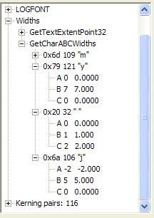 |
| ABC dimensions for Times New Roman, characters "y", "space" and "j" |
 |
| Character layout for Times New Roman |
 |
| ABC dimensions for Palatino Linotype font under Windows |
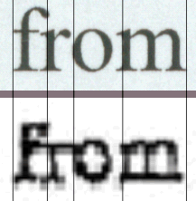 I have received several comments on the above essay. One of them suggested
that it is hard to tell if the "fr" really has the f and r overlapping. So what
I did was take my copy of the 18-aug-73 memo, printed at 1200 dpi, and scan it
in at 600 dpi and extracted the word "from". I then did a copy-and-paste of the word "from" from the
(admittedly poor) CBS image. I placed both of these in Microsoft PowerPoint,
stretched them to the same left-to-right length (maintaining aspect ratio!), and
drew some lines. Now I admit there is a lot of distortion in the CBS image (if
they really want expert opinion, they should post a 600dpi scanned TIFF image of
each memo on
their site!), yet the results are amazingly close. This verifies my visual
inspection. It is unlikely that such coincidence could occur if the fonts were
not the same font. Note that even if you might like to believe that the "r" is
not tucked under the "f", if it weren't, the subsequent characters would be
horizontally misplaced to the right in the CBS memo, yet, relative to even the
poor image quality, it is clear the positions correspond.
I have received several comments on the above essay. One of them suggested
that it is hard to tell if the "fr" really has the f and r overlapping. So what
I did was take my copy of the 18-aug-73 memo, printed at 1200 dpi, and scan it
in at 600 dpi and extracted the word "from". I then did a copy-and-paste of the word "from" from the
(admittedly poor) CBS image. I placed both of these in Microsoft PowerPoint,
stretched them to the same left-to-right length (maintaining aspect ratio!), and
drew some lines. Now I admit there is a lot of distortion in the CBS image (if
they really want expert opinion, they should post a 600dpi scanned TIFF image of
each memo on
their site!), yet the results are amazingly close. This verifies my visual
inspection. It is unlikely that such coincidence could occur if the fonts were
not the same font. Note that even if you might like to believe that the "r" is
not tucked under the "f", if it weren't, the subsequent characters would be
horizontally misplaced to the right in the CBS memo, yet, relative to even the
poor image quality, it is clear the positions correspond.
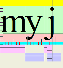
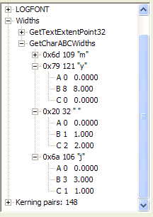
Another alert reader suggested that the "j" from "my job" shows that the tail
of the "j" overlaps the preceding space. So I used my Font Explorer to reveal
the parameters of the "j". Note that the "j" has a negative A-offset value,
meaning that the character will overlap the preceding character. He also
observed that the "y" did not "tuck its tail" under the preceding
character, and note that the A-offset for "y" is 0, so this is consistent with
his observation. So I did the same comparison, from my scanned image of "my job"
and the CBS image of "my job" from the 18-Aug-73 memo. The results are shown
below. Of course, to those of us who have already figured out that these are
forgeries, this result comes as no surprise at all.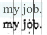
The Font Explorer is a program which comes with our book, and can be downloaded from my site as part of the CD-ROM image that came with the book; it is something like 17MB, so you may not want to download this on a dialup; I have a separate .zip file which is the FontExplorer.exe file itself. (Note to programmers: this was built under Visual Studio 4.2. I have not attempted to recompile it under any later version of Visual Studio, including 5.0, 6.0, 7.0 or 7.1. If you download the source, you're on your own here).
One question that came up was whether this was really Times New Roman, or perhaps Palatino, a font very similar to Times New Roman. I looked in my font list (I have hundreds of fonts installed on my machine), and found a font called "Palatino Linotype". Admittedly, this does not say anything about the font that might be used by a sophisticated typesetter in 1972, but it shows that the hoaxer really did use Times New Roman and not Palatino. Look at the ABC widths for the same characters; note that the "j" in the Palatino font has a 0 A-offset, instead of a –2 A-offset. Several other dimensions, such as y.B and j.C also do not correspond. I decided to not waste time creating, scanning, and otherwise displaying a document done in Palatino simply because the differences should be obvious just from reading the ABC dimension specification.
 Another
reader sent me a pointer to a higher-resolution scan of the notorious
"superscript" image. I went there, and downloaded the image. Shown to the left
is the result of adding this (the bottommost of the three images) to my
comparison chart. No surprises here, it again emphasizes that the "superscript"
did not rise above the top of the line.
Another
reader sent me a pointer to a higher-resolution scan of the notorious
"superscript" image. I went there, and downloaded the image. Shown to the left
is the result of adding this (the bottommost of the three images) to my
comparison chart. No surprises here, it again emphasizes that the "superscript"
did not rise above the top of the line.
One person actually suggested that I was saying that because of this "th", and my assertion that a superscript would indicate a forgery, that I am claiming that all documents released by the Texas Air National Guard must be forgeries. I have never come close to saying that. I merely point out that if a typewriter has a superscript-like entity, as it shown here on the left, it is completely unlike the superscripting of Word, which is coincidentally exactly identical to the superscripting of the forged documents. The "th" in the Texas Air National Guard documents is not a superscript, but a monospaced ligature that fits within the bounding box of the character space. So let me be very pedantic here: the "th" in the released documents is not, I repeat, not, a superscript. It is a single character.
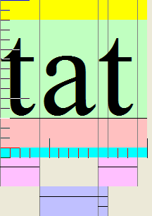
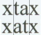
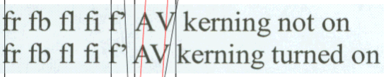
Another correspondent pointed me to a site that claims that Word does automatic kerning. Sorry to disappoint the poster, but what he is reporting on is not kerning in the sense that Word or a typographer means kerning, but the significant fact that the ABC widths contain a negative C-width. He points out that "at" and "ta" actually come out as different widths. This is true, but it is not true kerning, which would rely on the pairwise information of "a" following "t" and "t" following "a"; instead it is the "pseudo-kerning" caused by a negative C-width on the character "a". A negative C-width applies no matter what character follows. For example, noting that "f" has a negative C-width works because most characters that "f" is paired with are "half-height" letters (I forget the actual technical term, but I think it is "minuscule", although according to some typographers this merely means any lowercase letter) and therefore there is no conflict. The only full-height letter "f" is paired with typically is "l", and the effect is to simulate the ligature "fl" that printers use. However, if it were true kerning, the kerning pair "fb" would indicate that the "b" needs to move to the right so as to not be connected to the "f", but since there is no "fb" used in ordinary English prose, this error is "harmless". This can be seen in my comparisons based on the Font Explorer output. Because of the C-width, there is no need to have a kerning pair for "f" and "r" to cause an overlap. Note however that there is a kerning pair for "AV", and the result is easily seen in the Kerning part of the Font Explorer. Note in the lower example that "fb" shows an improper overlap, because not only does the negative C-offset for f cause the next character to "tuck under", but there is no positive kerning value for the pair "fb". Therefore, it is incorrectly rendered with the "f" touching the "b". Microsoft apparently only provides kerning pairs when there is a need to override the built-in font parameters.
I realize this is a fine-point quibble, but my view, and the view of typographers, is that kerning is always a per-character-pair operation, and the C-width parameter is fixed as part of the character definition. In either case, casual technology readily available in offices in 1972 would be incapable of either effect. But when I state the document is not kerned, I mean that pair kerning is not enabled; the only apparent kerning is the overlap generated by the A and C offsets. There are many technical reasons that pseudo-kerning is more desirable than true pair kerning, but that would take at least another page to explain issues such as how print files are created, the costs of doing a download to a printer, the feasibility of doing arbitrary text placement in the printer compared to having the printer use built-in TrueType fonts and pseudo-kern automatically, and so on. Pseudo-kerning is a "good enough" approximation of true kerning that it is good enough for everyday use.
Kerning was possible using hand-set lead type, as one person pointed out, by having fonts where the character actually overhung the edge. The problem with this was that these fonts, extensively used by high-end professional printers (and even today by those who still do hand-set type) were quite expensive, particularly because of the potential for damage to the overhanging part of the character. Such kerning was impossible for hot-lead type processes. But it meant a higher cost to get a set of type (more characters had to exist in the type slugs), more time and care in doing the typesetting (meaningful only when cost was essentially not an object), and even more time in tearing down and re-sorting the type slugs. Most print shops did not bother much with these details. Unfortunately, the only "artisan" printer I know who did hand-set type lives about three hours' drive away, and given the more obvious aspects of the forgery, it is not worth my time to go out and examine his type.
|
Pseudo-kerning using negative C-width |
|||
 |
 |
  |
|
| ABC widths of "t" and "a". | Display of "tat". | "f" kerning pair info. Note that it pairs only with another "f" or a right single quote (character code 146) where it has a positive kerning value. | Showing that "ta" and "at" have slightly different representations. The example shown at the indicated site is correct, but the reasoning is incorrect. No pair kerning is involved. |
|
Turning on kerning, at its effects (1) |
||
 |
 |
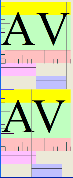 |
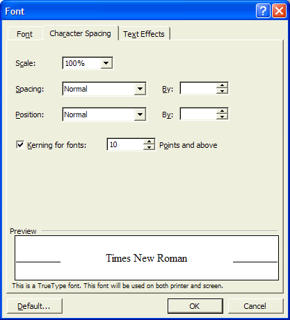
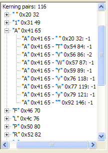
| The option "Format > Font", choosing the character spacing tab, enabling kerning. | ""AV" kerning pair info: the kerning value for "V" following "A" is -2. | Upper image: "AV" without kerning. Lower inage: "AV" with kerning turned on. |
|
The effects of kerning when kerning pairs are used in the example |
|
|
| Upper example: a line with kerning turned off. Lower example: the same line with kerning turned on. Note that the right quote has additional space, and the AV show overlap. Note the incorrect overlap of "fb" in both cases. And the illusion that "fl" and "fi" are ligatures. |
| The angled green line shows the change of position of the right quote when kerning is enabled. The sloped red line shows the displacement of the A, and if there were no kerning, the V would be displaced by the same amount, but in fact the lower V is more to the left than the red lines predict. |
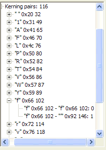
Turning on kerning has an effect only if there is a kerning pair. For example, in "The quick brown fox jumps over the lazy dog", the Font Explorer gives the information about the kerning pairs as shown below. In the following tables, I use sp to indicate a space character, and rt' to indicate a right curly quote and lt' to indicate a left curly quote (which usually doesn't appear on a Web page). Note that a kerning value of 0 seems to have no effect on the built-in ABC widths.
|
Kerning data for "The quick brown fox jumps over the lazy dog ff" |
|||||||||||||
| Th | none | he | none | e space | none | space q | none | qu | none | ui | none | ic | none |
| ck | none | k space | none | space b | none | br | none | ro | none | ow | none | wn | none |
| n space | none | space f | none | fo | none | ox | none | x sp | none | sp j | none | ju | none |
| um | none | mp | none | ps | none | s sp | none | sp o | none | ov | none | ve | none |
| er | none | r sp | none | sp t | none | th | none | he | none | e sp | none | sp l | none |
| la | none | az | none | zy | none | y sp | none | sp d | none | do | none | og | none |
| g sp | none | sp f | none | ff | 0 | ||||||||
So based on one poorly-constructed example, the poster claims "Apparently then the whole kerning option objection is a red herring." Unfortunately, his experiment is flawed, and the conclusion meaningless. He did not actually measure any kerning effects, because there were no kerning effects possible given the selection of letter pairs in the example.
Here are the actual kerning pairs for Times New Roman, and their values. These were derived from my Font Explorer. To illustrate the effects of kerning, as I did, a known kerning pair must appear in the font sample. I used two, AV and f rt'.
|
Kerning Pair Data for Times New Roman Font |
|||||||||||||||
| sp A | -1 | sp T | 0 | sp V | 0 | sp W | 0 | sp Y | 0 | 11 | 0 | A sp | -1 | AT | -1 |
| AV | -2 | AW | -1 | AY | -1 | Av | -1 | Aw | -1 | Ay | -1 | A rt' | -1 | F, | -1 |
| F. | -1 | FA | -1 | L sp | 0 | LT | -1 | LV | -1 | LW | -1 | LY | -1 | L rt' | -1 |
| P sp | 0 | P, | -1 | P. | -1 | PA | -1 | RT | -1 | RV | -1 | RW | -1 | RY | -1 |
| Ry | -1 | T sp | 0 | T, | -1 | T- | -1 | T. | -1 | T: | -1 | T; | -1 | TA | -1 |
| TO | 0 | Ta | -1 | Tc | -1 | Te | -1 | Ti | 0 | To | -1 | Tr | 0 | Ts | -1 |
| Tu | 0 | Tw | -1 | Ty | -1 | V sp | 0 | V, | -2 | V- | -1 | V. | -2 | V: | -1 |
| V; | -1 | VA | -2 | Va | -1 | Ve | -1 | Vi | -1 | Vo | -2 | Vr | -1 | Vu | -1 |
| Vy | -1 | W sp | 0 | W, | -1 | W- | -1 | W. | -1 | W: | 0 | W; | 0 | WA | -1 |
| Wa | -1 | We | -1 | Wi | -1 | Wo | -1 | Wr | -1 | Wu | -1 | Wy | -1 | Y sp | 0 |
| Y, | -2 | Y- | -1 | Y. | -2 | Y: | -1 | Y; | -1 | YA | -1 | Ya | -1 | Ye | -1 |
| Yi | -1 | Yo | -1 | Yp | -1 | Yq | -1 | Yu | -1 | Yv | -1 | ff | 0 | f rt' | 1 |
| r, | -1 | r- | 0 | r. | -1 | rg | 0 | r rt' | 0 | v, | -1 | v. | -1 | y, | -1 |
| y. | -1 | lt' lt' | -1 | rt' sp | -1 | rt' s | -1 | rt' t | 0 | rt' rt' | -1 | G, | -2 | G. | -2 |
| St | 0 | ||||||||||||||
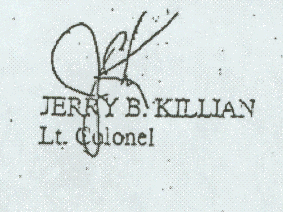
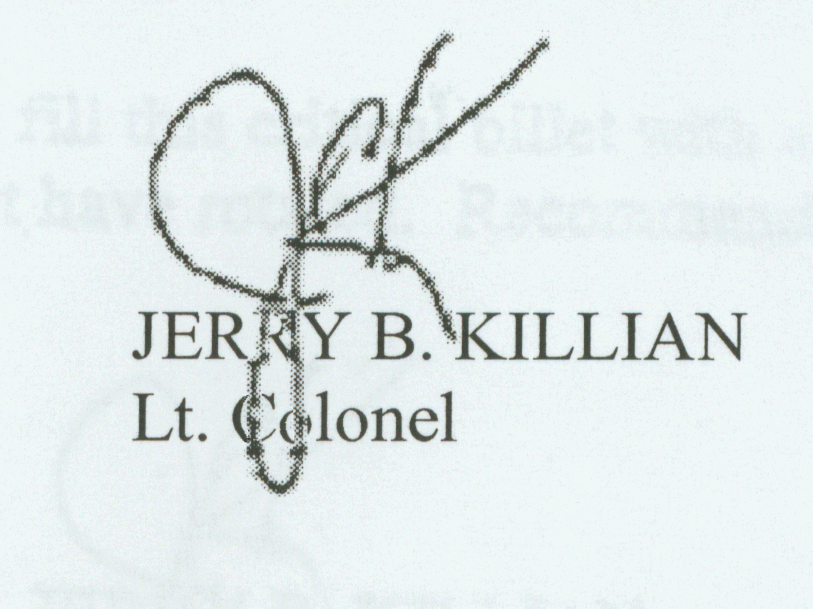
Another reader pointed out that he was able to forge the signature. Unfortunately, he sent me an example as a Microsoft Word document, and I do not under any circumstances open potentially executable files, including those that can hold macro viruses. Several levels of virus protection and firewalls not withstanding, this is simply my flat-out policy. So I apologize to him on not being able to comment on his work. But I had actually done this Friday night; it took me about 10 minutes. I took the CBS document, printed it, scanned it in (to remove some of the artifacts of the display), extracted the signature with a copy-and paste, did some cleanup to remove the "dirt" from the scan, gave it a transparent background, saved it as a .gif file, and pasted it into my document. Now the result in this case is pretty evidently a forgery, because of the artifacts. But someone with access to an authentic signature and a high-resolution scanner could have done a much more convincing job. For example, here are three scans. The leftmost is the one from the CBS memo, which I printed out and then rescanned (to avoid artifacts of the low-resolution display). The second is the result of copying the signature from that scan, and doing a bit of transparency hacking, then pasting it into my document. The third example is the result of hand-tracing the signature, by holding it against my CRT screen. This was my third attempt at tracing the signature. Any respectable signature analyzer could spot several clues that would indicate it is a fake (such as the irregularities caused by inept tracing, but doing a trace vertically is a bit challenging), but it suggests that anyone with a bit of practice could either extract a high-resolution signature from a real document, or a tracing of a real signature. Without the original document (not a photocopy) it would be impossible to tell a good forgery from a real signature. Note how much the "noise" in the CBS version, not to mention the low resolution, makes it hard to do any analysis; my second image is clearly a fake because the quality of the signature is so much poorer than the quality of the type behind it (whereas in the CBS image, the quality of the signature and the quality of the text are equally poor). But this illustrates that it is within the scope of credibility that an authentic signature could have been pasted onto a fake document (if I had used my real signature in the third example, it might have looked as if I had signed it!) Lacking the original documents, there is nothing the copy can demonstrate that is convincing. (Sometimes I have been required to sign a contract specifically in "blue pen" so that there could be no question about the authenticity of the original signature!)
 |
 |
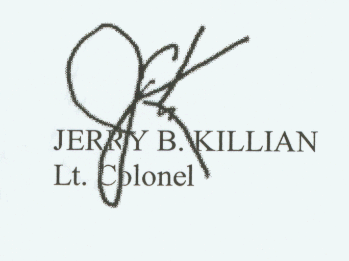 |
| The original CBS .pdf file, printed out by me at 1200dpi, scanned at 600dpi. | The CBS signature, copied, cleaned a little bit, and pasted, then printed and rescanned. 10 minutes. | My somewhat inept tracing, scanned, and pasted onto my fake document. Printed, and rescanned to get this image. 20 minutes, most of it spent getting a nice clean signature bitmap. |
For a picture of a Varityper, take a look at a page I was pointed to by one of my readers: http://cgi.ebay.com/ws/eBayISAPI.dll?ViewItem&category=12&item=3747314674&rd. Examine carefully the number of controls on this device. This is what I remember from my aunt's print shop. Now in the list of unlikely coincidences, what is the likelihood that this device existed, was used to produce a casual memo, and was used by someone who didn't type, and used so well that it gave a quality not only as good as Microsoft Word, but identical to Microsoft Word?
Someone argued that the issue of the centering could be accounted for by the fact that the memo was typed on preprinted letterhead stationery, so the argument about centering the address precisely is a red herring. In that case, I observe that the font used for the heading and the font used for the body are, just coincidentally, the same font, and that, amazingly enough, the heading is centered (as many others have observed) in exactly the same way relative to the body of the text as Word would have centered text. Had the memo body been typed at a different time than the preprinted heading, why is the vertical spacing between the heading and the body the same as that of Word, and the horizontal alignment the same relative alignment as a Word document? There are far too many coincidences here to be credible.
In one reply, I came up with the "smoking gun" analogy. Imagine you are watching part of a trial on "Law & Order" or some similar drama. The arresting officer has just testified. Witness: "we heard a gunshot. When we entered the room, we found the accused standing over the body, with a smoking gun, and later analysis showed powder traces on his hands. Although the bullet was somewhat distorted when it hit the wall after passing through the victim, our forensic expert says that the probability that it was shot by that gun is 90%". Defense attorney: "Did you actually see my client pull the trigger?" Witness: "No sir, I did not see him actually pull the trigger." Defense attorney: "Therefore, sir, you must admit there is reasonable doubt about my client's guilt, and I ask the jury to acquit". Prosecutor: "the alternative hypothesis, that someone else owned a gun with the same characteristics, came in behind the accused, shot the victim, and the accused shot at this hypothetical intruder in self-defense, is not very likely. Particularly since two shots were not heard. Therefore, the evidence is overwhelmingly in favor of the hypothesis that the accused committed the crime, and you must convict". What do you think the verdict is going to be?
I have been used as an expert witness in several computer-related cases, and done deposition under oath in a number of them. I have tried to prepare this report with the same care that I would have prepared my testimony for deposition (no, I have not actually testified in court; the cases I was involved with either were settled out of court, or were settled in trial without need for any additional testimony from me).
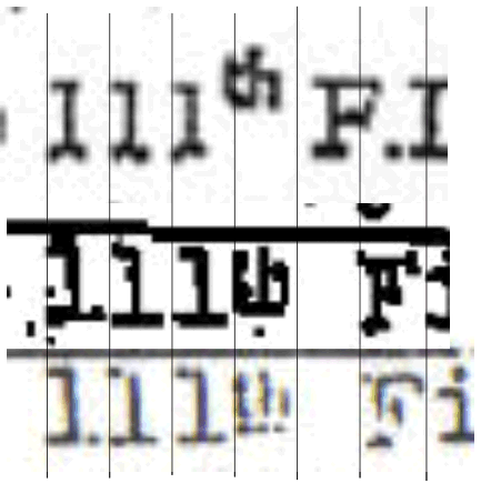
CBS now claims that the memos are genuine because they use lower-case Ls and not digit 1s for the 111th. Let's examine this. The images are all taken from the 04-May-1972 image. I obtained this image by printing the CBS pdf file on my printer and scanning in the image. This removes some of the distorting artifacts of the screen display (most of my images of the memos are from scanned images of the printed pdf file).
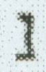
First, here's a little exercise. Of these two symbols, which is the numeral 1 and which is the lower-case L? I include one of each, from my scanned document and from the CBS document. Obviously, A and B are from my printed document and C and D are from the CBS document, but which character is shown for each?
 |
 |
 |
|
| A | B | C | D |
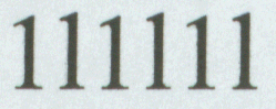 Now perhaps an expert font
designer (for example, Don Knuth or someone who works for Adobe, Linotype, or
someplace like that) could tell you which of A or B are the one and the
lower-case L, but no expert is going to be able to make sense of the two
incredibly poor images of the CBS memo. Let's look at another image from the
scanned document I created with Microsoft Word. Here's a sequence of ones and
Ls. Which is which? Note that someone looking at an actual-size representation
of these two characters would need a very precise measuring magnifier to tell
the difference; I actually had to go back and look carefully at my document and
type the characters again. The sequence is one-L-one-L-one-L. Let's take a look
at what Font Explorer tells us about this sequence, or at least the first two
characters. According to Font Explorer, a numeral 1 has a width of 6 and a
lower-case L has a width of 3.
Now perhaps an expert font
designer (for example, Don Knuth or someone who works for Adobe, Linotype, or
someplace like that) could tell you which of A or B are the one and the
lower-case L, but no expert is going to be able to make sense of the two
incredibly poor images of the CBS memo. Let's look at another image from the
scanned document I created with Microsoft Word. Here's a sequence of ones and
Ls. Which is which? Note that someone looking at an actual-size representation
of these two characters would need a very precise measuring magnifier to tell
the difference; I actually had to go back and look carefully at my document and
type the characters again. The sequence is one-L-one-L-one-L. Let's take a look
at what Font Explorer tells us about this sequence, or at least the first two
characters. According to Font Explorer, a numeral 1 has a width of 6 and a
lower-case L has a width of 3.
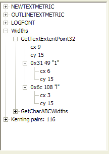 |
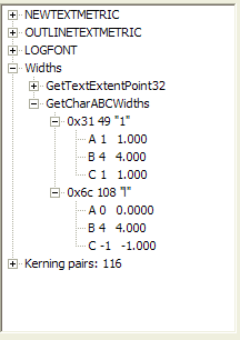 |
 |
| Widths and heights of one and lower L. Note that character code 49 is the numeral 1 and character code 108 is the letter l. | ABC widths of one and lower L. Note that A+B+C=6, the cx value of one. For the lower L, A+B+C=0+4-1=3, the cx value of lower L | The picture of a numeral one followed by a lower case L. The differences in height are very subtle. |
Now we've established that we need a really, really good eye to tell visually a lower case L from a digit one. And that the quality of the CBS memo is inadequate for that purpose. But is it really inadequate? Taken out of context, that is true, but we are able to look at these characters in the context of an actual document.
I consider myself very good on typography, and even in the enlarged form, from a 600dpi scan of a 1200dpi image of 10-point type, I could not tell which character was the numeral 1 and which character was the lower-case L. Yet, from a photocopy (not even the original), CBS can make a pronouncement that the document is authentic because it uses a lower-case L for the digits.
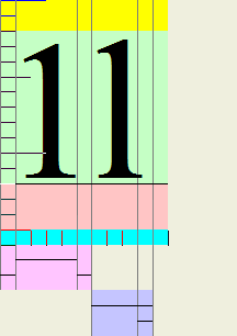
But it is far worse than that! They clearly know nothing about how to
analyze fonts. Let's take another piece of that document, only this time we're
going to look at sequences. The following illustration shows part of "111th
F.I.S." from item 2 of the memo, and two words, "will" (from item 2) and
"Ellington" (from item 1). While we can't tell the difference from the vertical
height, but look at the horizontal spacing! Note that the two lower-case Ls of
"will" and "Ellington" are very narrow. In fact, probably three units (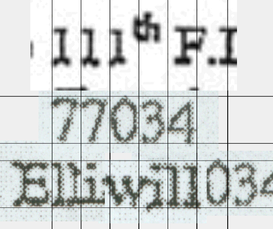 what
a coincidence!), while the three ones making up 111th are "monospaced",
particularly when compared with the "77034" from the letterhead of same document
(remember, I observed that all digits have the same width, so that columns of
digits line up vertically). Now, what I did here was line up the 77034 under the
111, doing the appropriate stretches maintaining aspect ratio so the digits line
up. Note that the widths of 111 in the document are the same widths as the 770.
But note: the two lower-case Ls from "Ellington" and from "will" fit inside
one numeric character width. Look at the widths the Font Explorer reveals: a
lower-case L has width 3, a digit has width 6. Two lower-case Ls fit inside a
single digit width. What CBS has just asked us to believe is that a lower-case L
when used to describe the 111th F.I.S. is somehow going to have a
width of 6, but the same character, when used in a word, is magically going to
get the width 3? Or could it be that what we are seeing is really a numeric
character 1, which has the same width as other digits, and a lower-case L? I'd
say that they are yet once again demonstrating that they are incompetent to do
the simplest and most obvious analysis of fonts.
what
a coincidence!), while the three ones making up 111th are "monospaced",
particularly when compared with the "77034" from the letterhead of same document
(remember, I observed that all digits have the same width, so that columns of
digits line up vertically). Now, what I did here was line up the 77034 under the
111, doing the appropriate stretches maintaining aspect ratio so the digits line
up. Note that the widths of 111 in the document are the same widths as the 770.
But note: the two lower-case Ls from "Ellington" and from "will" fit inside
one numeric character width. Look at the widths the Font Explorer reveals: a
lower-case L has width 3, a digit has width 6. Two lower-case Ls fit inside a
single digit width. What CBS has just asked us to believe is that a lower-case L
when used to describe the 111th F.I.S. is somehow going to have a
width of 6, but the same character, when used in a word, is magically going to
get the width 3? Or could it be that what we are seeing is really a numeric
character 1, which has the same width as other digits, and a lower-case L? I'd
say that they are yet once again demonstrating that they are incompetent to do
the simplest and most obvious analysis of fonts.
Note that I included on the third line the same 77034 line (only the 034 part is visible). I did this to show that I am showing the text at the same size in all cases. Note the horizontal lines I drew. What I did was draw a pair of lines around the 77034, then copy and paste them and move them down. I then made sure that I expanded the characters (maintaining, always, the same aspect ratio: no fakery here. And you, too, can do it!) so they were normalized vertically, then shifted them until then lined up with the vertical lines. Now, we see that the matches are not quite perfect, but we can blame that on the poor quality of the CBS image. I could be accused of having, perhaps, a 10% error here, caused by poor image quality. But to satisfy the CBS claim, I would have to have a factor-of-2 error. As a physicist would say "Dead on, within experimental error bounds". It is one thing to admit to a hoax; it is another entirely to keep pretending they can come up with convincing evidence that they were not hoaxed when anyone, particularly once I've pointed out the analysis, can repeat the analysis and get the same result I got! And that result proves their assertion false.
 |
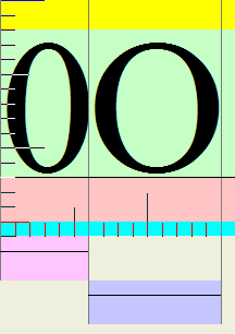 |
 |
| Zero (6 units) and letter-O (9 units) | The differences between the digit 0 (left) and the letter O (right) | Comparison of digit 0 and letter O. Note that letter O appears to be 50% wider (9 units) than digit 0 (6 units) |
But let's pursue this. Why a lower-case L? This is because typewriters (such as the 1940s Underwood I learned on) did not have a digit 1 or a numeral 0. Instead, lower-case L was used, and capital O. Many people who learned to type in the 1950s (I learned when I was 12, in the summer of 1959) and through the 1960s learned this technique. Even when we had typewriters that had a numeral-1 and a digit-0, or computer keyboards that had these, still continued to use the lower-case-L-capital-O techniques. Now if CBS is arguing that the lower-case L was used, it would suggest someone who also would use the letter O for the digit 0. Yet look at the letterhead! "P.O. Box" and "77034" clearly show that the O and 0 were distinct. Someone who used a lower-case L for the digit 1 is unlikely to suddenly use a digit 0 distinct from a capital O. Yet they are clearly different. So we are not dealing with someone who thinks of lower-case L for digit 1, or capital-O for digit 0. So the rationale that a lower-case L was used (besides the obvious failure illustrated above) seems even more insupportable. Someone who used a lower-case L from habit would also have used a capital O for a digit. Yet we do not see this.
I had used "F.L.S." in some of the text preceding this. It should have read "F.I.S." and I have made that fix. I misread it the first time I typed it, then copied my own typing error.
(I would have loved to have stolen the title from one of the www.littlegreenfootballs.com site, "Selectric Theory Decomposing", but that was already used...)
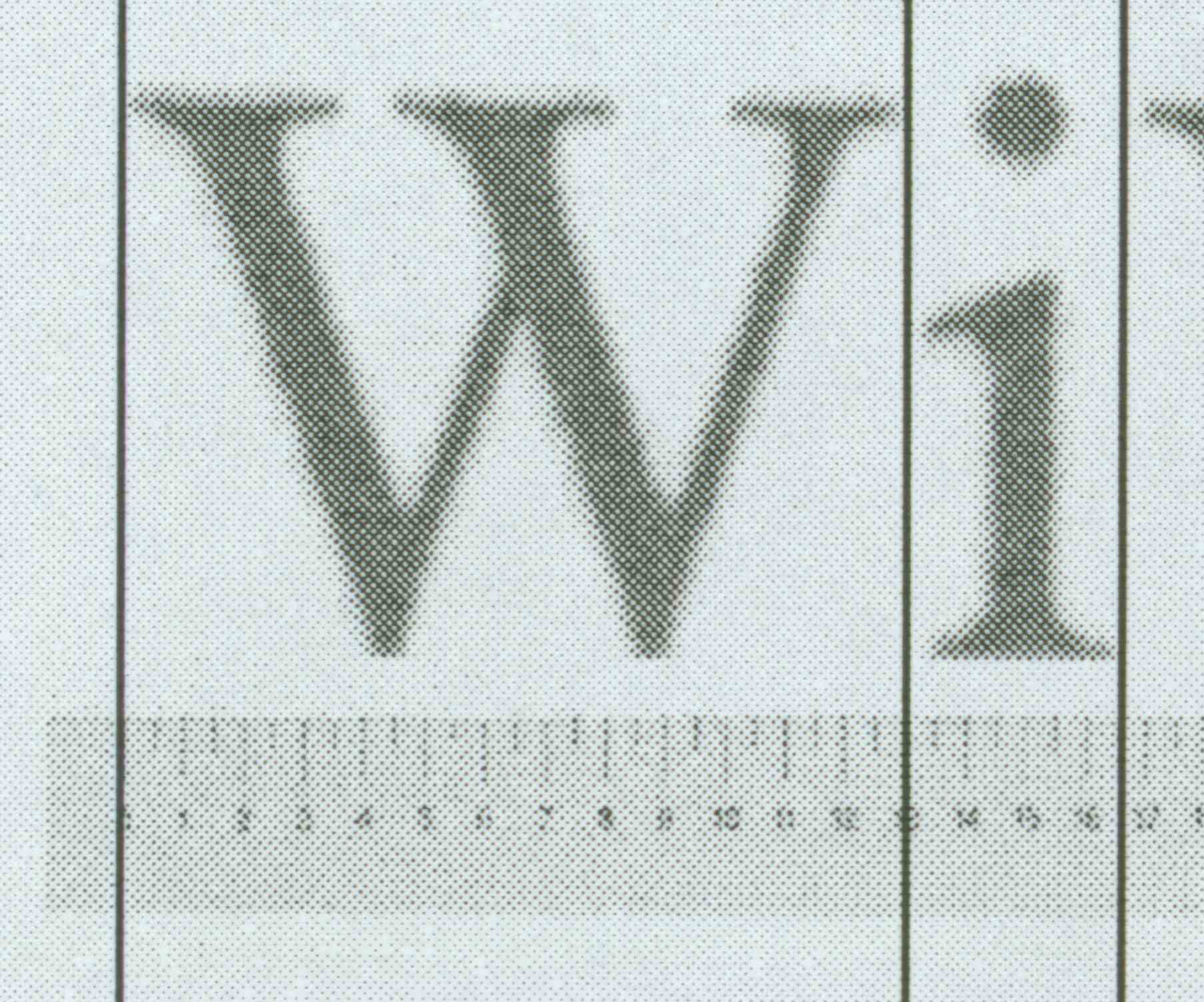
One of my correspondents pointed me at a site that has a Selectric Composer Font Table. So I'm going to compare a few of the characters from this table with the Microsoft Times New Roman font. Now, the problem in doing comparisons of "widths" is that each font has its own local coordinate system, so looking at the absolute numbers doesn't help. But it appears that the Selectric Composer could not do kerning automatically, so the A/C values for the Times New Roman are interesting because the show a feature not easily available. The W parameter is the actual character width seen by a document, and W% is a "magic number", which is the "percentage of the W character" width (I chose "W" because it is the widest alphabetic character in the font). If the fonts were proportionally compatible, that is, typing on the Selectric Composer would produce pixelwise-identical output of the font (even though it doesn't actually use pixels; by this I mean what we would see if we scanned two images), then the ratios of character widths should be the same. The table below illustrates the computations I have done. Without actually having one of these marvelous devices in my hands to examine, this is clearly a passive analysis. But it seems to be quite revealing.
If the fonts were truly width-compatible, we would see that the W% value between the Selectric Composer and the Times new Roman fonts would be identical. That is, if I wrote "WiWiWi", on a Selectric Composer I would get a sequence of characters (9+3+9+3+9+3)=36 units wide, or 4 times the width of a "W". So I should see that typing another line of four "W" characters underneath produced the same width. But if I type the same line in Times New Roman, I should get (13+3+13+3+13+3)=48, or 3.69 times the width of a Times New Roman W. So if I typed 4 "W" characters underneath, using Word, they should be wider.
So I did the experiment. More on this, below, but look first at the table.
Remember that the A-width is the offset of the character from its nominal start position, if negative it will be "tucked under" the previous character. The C-width is the offset of the character position pointer from the nominal character position; if negative the following character will be "tucked under" the current character. The W parameter is always A+B+C, and is the width seen by a document production system such as Word.
| Character | Selectric | Times New Roman | Character | Selectric | Times New Roman | ||||||||||
| Width | W% | A | B | C | W |
W% |
Width | W% | A | B | C | W | W% | ||
| A | 8 | 88.9% | 10 | 76.9% | a | 5 | 55.5% | 0 | 7 | -1 | 6 | 46.2% | |||
| B | 7 | 77.8% | 8 | 61.5% | b | 6 | 66.7% | -1 | 8 | 0 | 7 | 53.8% | |||
| C | 7 | 77.8% | 8 | 61.5% | c | 5 | 55.5% | 0 | 6 | 0 | 6 | 46.2% | |||
| D | 8 | 88.9% | 9 | 69.2% | d | 6 | 66.7% | 0 | 8 | -1 | 7 | 53.8% | |||
| E | 7 | 77.8% | 7 | 53.8% | e | 5 | 55.5% | 0 | 6 | 0 | 6 | 46.2% | |||
| F | 7 | 77.8% | 7 | 53.8% | f | 4 | 44.4% | -1 | 7 | -2 | 4 | 30.1% | |||
| G | 8 | 88.9% | 8 | 61.5% | g | 5 | 55.5% | 0 | 7 | 0 | 7 | 53.8% | |||
| H | 8 | 88.9% | 9 | 69.2% | h | 6 | 66.7% | 0 | 8 | -1 | 7 | 53.8% | |||
| I | 4 | 44.4% | 4 | 30.1% | i | 3 | 33.3% | 0 | 3 | 0 | 3 | 23.1% | |||
| W | 9 | 100.0% | 0 | 13 | 0 | 13 | 100.0% | w | 8 | 88.9% | 0 | 9 | 0 | 9 | 69.2% |
 Now
the anomaly. Examine this picture. I got this by typing the text into Word,
printing it on my laser printer, scanning it in, pasting it into PowerPoint, and
adding the vertical lines. Then I took my handy-dandy typographical ruler,
scanned an image of it in. Then with a little stretching I show that the
width of four W characters is indeed 4*13=52 units. But the "WiWiWi" doesn't
work out! Well, I supposed someone might claim that this proves I have no idea
what I am talking about. Actually, the real problem is that I have tried to
simplify a lot of things in these discussions. I had hoped to avoid a discussion
of concepts such as font hinting, nonlinear scaling, and twips. But this forces
the issue. So, technies, enjoy, and the rest of you, I hope you follow some of
it.
Now
the anomaly. Examine this picture. I got this by typing the text into Word,
printing it on my laser printer, scanning it in, pasting it into PowerPoint, and
adding the vertical lines. Then I took my handy-dandy typographical ruler,
scanned an image of it in. Then with a little stretching I show that the
width of four W characters is indeed 4*13=52 units. But the "WiWiWi" doesn't
work out! Well, I supposed someone might claim that this proves I have no idea
what I am talking about. Actually, the real problem is that I have tried to
simplify a lot of things in these discussions. I had hoped to avoid a discussion
of concepts such as font hinting, nonlinear scaling, and twips. But this forces
the issue. So, technies, enjoy, and the rest of you, I hope you follow some of
it.
In the Font Explorer, I get those font metrics in a mode known as "MM_TEXT" mode. In this mode, one unit distance up or down represents one pixel on the screen. Word, however, used a coordinate system known as "twips" where a "twip" is one TWentIeth Point. A point, in printer terminology, is approximately 1/72 of an inch, so a 10-point font should be 10/72 of an inch high. This is obtained by using the MM_TWIPS mapping mode. I am not privy to the internals of how Word works, but this only gives 1440 dots per inch, and my printer can print at 2400 dots per inch (if I want to), which is phototypesetter quality. So it may be that modern versions of Word use even higher resolution internally. But the answer is that most displays will show about 100 dots per inch, so twips gives 14 times the accuracy of placement that a display can give. When rendered on a 300dpi, 600dpi or 1200dpi printer, this means that the character placement can be quite precise on the printed page, even if it looks a bit hokey on the screen (I don't know if you've ever noticed the occasional apparently-misplaced letter on the screen; this is necessary so that it renders correctly with serifs and fine details; it is moved to a pixel boundary, which induces a roundoff error that could make it look slightly off-position. But when you print it, you see a better rendering because the 1-pixel error is 1/300th, 1/600th, 1/1200th or 1/2400th of an inch. The error is still there, but it is a 1-pixel error with very, very small pixels).
Now my Font Explorer only uses MM_TEXT mode, and because older computers worked well only with integer values, not with decimal numbers, integer values were used. So I see 3 for the width, not something different. But when rendered for a high-resolution device, those numbers are multiplied internally by the device resolution and can give additional fineness of width and positioning. It is worth pointing out that a modern Pentium can do a 32-bit single-precision floating-point multiply in the same time (and actually, at the same time) it is doing an integer add. (For those of you who are nontechnical, that last sentence means "decimal numbers are no longer an issue in modern computers).
There are nonlinearities in font representation. Don Knuth, when he was doing typography, talked to many real font designers. They explained that if you take an 8-point character and make it a 16-point character, you don't "blow it up" by a factor of 2. The edges of letters like O, the vertical bars of letters like i, L, etc., get thick and ugly. A good font designer designs an 8-point font, a 10-point font, a 12-point font, a 16-point font, and so on, and if you were to optically blow up the 8-point character by a factor of 2 and place it over the 16-point character, you would not get a perfect match. The 16-point character would actually be slightly "lighter weight" in those dimensions. Because computer screens and printers work in integral units called "pixels", and visually, human beings can notice slight differences in small dimensions, you must additionally handle how you deal with what happens when a curve of a line covers a "half pixel" of space. The pixel can have only one solid color. What is it? Well, if in the "abstract" space where we treat the pixel as a big rectangle, we could choose to paint it either black or white. On a screen, we might even use shades of gray (a technique also known as "anti-aliasing") to fool the eye into thinking there is a smooth curve when in fact there is not. When serifs are involved, however, you have to take into account the fact that the letter "i" when properly positioned would, in some places, be right-on-top of a set of pixel definitions, so the vertical bar might be two pixels wide and the serifs extend out one pixel (look at fonts on your screen with a 10x magnifier if you don't believe all this). But in another place, it might be offset by a half-pixel. So we have to figure out how to render it. The way we render it is to shift it left or right by a "half pixel" amount and then render it. This is basic digital font technology these days. Fonts like Adobe Type 1 fonts, TrueType, and the now-rebranded cross-licensing technology (I believe it is Apple, Adobe, and Microsoft combined) OpenFont technology use what is generically called "font hinting", where each character in addition to its basic outline shape includes information about how to do nonlinear scaling, how to maintain correct-looking curves and serifs when pixelated, and so on. The computations which use this hinting were, in the past, quite proprietary, and are still not known in their precise detail outside those who license the technology. I am not such a licensee.
So I printed out the WiWiWi and scanned it in, and to my initial dismay, I discovered that although I could place my ruler on the screen and adjust the magnification so the "W" was 13 units on my ruler, this made the "i" be about 3.5 units. The result of this was that instead of the "WiWiWi" being 48 units wide it appeared to be 50 units wide. The difference between 39 and 50 is 11, meaning the actual apparent width of the "i" is 3.6 units, a pretty close match to my visual rough estimate. Note that if you were to use 3.5 for the width of "i", the ratio W% would be 26.9%, which again is different from the 23.1% ratio for TrueType fonts or the 33.3% ratio of the Selectric Composer.
I apologize for the poor quality of the image, but a good-quality image of this illustration takes 6MB and I'd like people to be able to download the page before the story becomes obsolete. Not to mention attempting to be kind to the hosting servers. So I've included a lower-quality JPEG image here. However, I emphasize that anyone with Word, a scanner, and a ruler can reproduce this experiment. (You can't just blow up a font in Word because of the aforesaid nonlinear scaling anomalies).
What is the implication of this? As Charles Johnson first showed with his animated GIF, and I showed on Fox News, not only does the memo that we typed in Microsoft Word correspond exactly to the CBS memo, but in fact even when the nonlinear scaling artifacts of the font are taken into account, the rendering is dead-on accurate! Yet the people who claim a Selectric Composer could do this now have to explain why the Selectric Composer could give a partial-unit spacing. And also, of course, why the character width ratios of the Selectric Composer, although completely different from Times New Roman, can create a document that is such a close match.
If someone can reproduce this using a Selectric Composer, I think in addition to seeing the document, we need a complete videotape showing it being done. I and anyone else who wants to reproduce this in Word can also show how long it takes us to duplicate it, on tape. It took me five minutes the first time, and I was very, very close except for eyeballing some double-spacing and getting the right number of carriage returns in for the vertical spacing. It took me three tries to get a perfect rendering. I do not think we will see a Selectric Composer scenario that is credible for anyone (let alone a non-typist) creating such a memo in 1972. In fact, let's have two videotapes: one of an experienced typesetter who uses that device doing it, and one of an ordinary typist (the kind you are likely to find in a typing pool of that era) doing it. This requires more stretch in my imagination than I saw in the salt-water-taffy I watched being made in Maine on my last vacation.
I find this coincidence too hard to believe. I repeat: in my expert opinion, these documents are modern forgeries.
Minor typos and a couple ambiguous usages changed. Thanks to my correspondent who pointed these out. I was trying to get a FedEx shipment ready, debug a program, and fit the typing of the 15-Sep-04 enhancement all in the same interval, so I did not proofread it as well as I should have.
(To all those who wrote to me: since you did not give me permission to use your names, I have refrained from doing so. However, if you want credit for your observations that led to this supplement, just send me email granting permission to credit you by name, and I'll be glad to give you explicit credit).
One of the essential tenets of scientific honesty is the ability of a third party to reproduce the work. There have been many excellent examples in the blogs of people comparing images of the documents with images of fakes, showing little if any error between the two; I saw no reason to reproduce those examples, since they are quite well done and quite compelling. I could have reproduced those examples, but I saw no reason to spend time duplicating such efforts. I chose instead to concentrate on the areas of font technology that were either misunderstood or misinterpreted.
I would like to point out that I have done nothing that anyone else on the Internet could not easily reproduce. To create these images, I used Microsoft Paint to first store the captured screen image from the Bush memo images released by CBS (my Internet-access machine does not have Corel Photo-Paint installed on it), then used Corel Photo-Paint to do the extractions. I have a MicroTek ScanMaker 6800 scanner, and I have been using Adobe Acrobat 5.0 to display the CBS images. Obviously, I used Microsoft Word for the document examples. My printer is a Xerox N4025 laser printer, which prints at 1200 or 2400dpi; all the work I did I did at the lower resolution. All scans were at 600dpi. I used Microsoft PowerPoint for some of the images, those that are doing the vertical line comparison. I am using my Font Explorer (to which I gave a link, which includes the complete source to the program), and in fact I am using the version of the program I compiled on 27-Oct-1996. There are some technical caveats in interpreting the output from font explorer because it suffers from certain nonlinearities, a complex problem to explain in a short memo. But it works real well if 10-point font is selected.
>dir i:\win32api\fontexplorer\release\*.exe
Volume in drive I is RAID5
Volume Serial Number is 9C66-A773

Directory of i:\win32api\fontexplorer\release

10/27/1996 02:15 PM 149,504 FontExplorer.exe
1 File(s) 149,504 bytes
Anyone with similar software can reproduce these examples. Adobe Illustrator could easily be used to reproduce these, and anyone who is a Windows programmer can write the Win32 system calls that give the same data that my Font Explorer so nicely displays. Anyone with a scanner could print their own document and rescan it (the reason for scanning the document is that printers, being higher resolution than displays, do not suffer from some of the artifacts of the display trying to approximate the printed image).
Please feel free to quote this material, use any of my images, etc. if you are reposting. I do ask that you provide a link to this page.